
Every kind of design has something in common. You have to think of the end user. It’s true, really, designs are made for a purpose, and that purpose is for someone or something! So, how do you design to take a customer to action? Having a brand that’s perceived as intended, and evokes strong emotions within their users is an excellent start.
To really dig deep into the visual intentions of UX design, I chose a website to analyze and then create a mood board for it. If you know what mood boards are used for, you may be thinking.. Why design a mood board for a website that’s already made? Well, the purpose of this is so I can put all of the thoughts behind the design into action. I’m a hands-on learner, what can I say?!
Before making the mood board, I first had to examine it from a critical eye. A great way to do that is with identifying some of gestalt principles used within their UX design.
The Brand
The site I chose for this perception/emotion analysis is called zee.dog. As a designer of pet products, and a lover of animals myself, I thought this would be a great opportunity to understand the awesome brand better. So here’s a little more information I found by looking through the site.
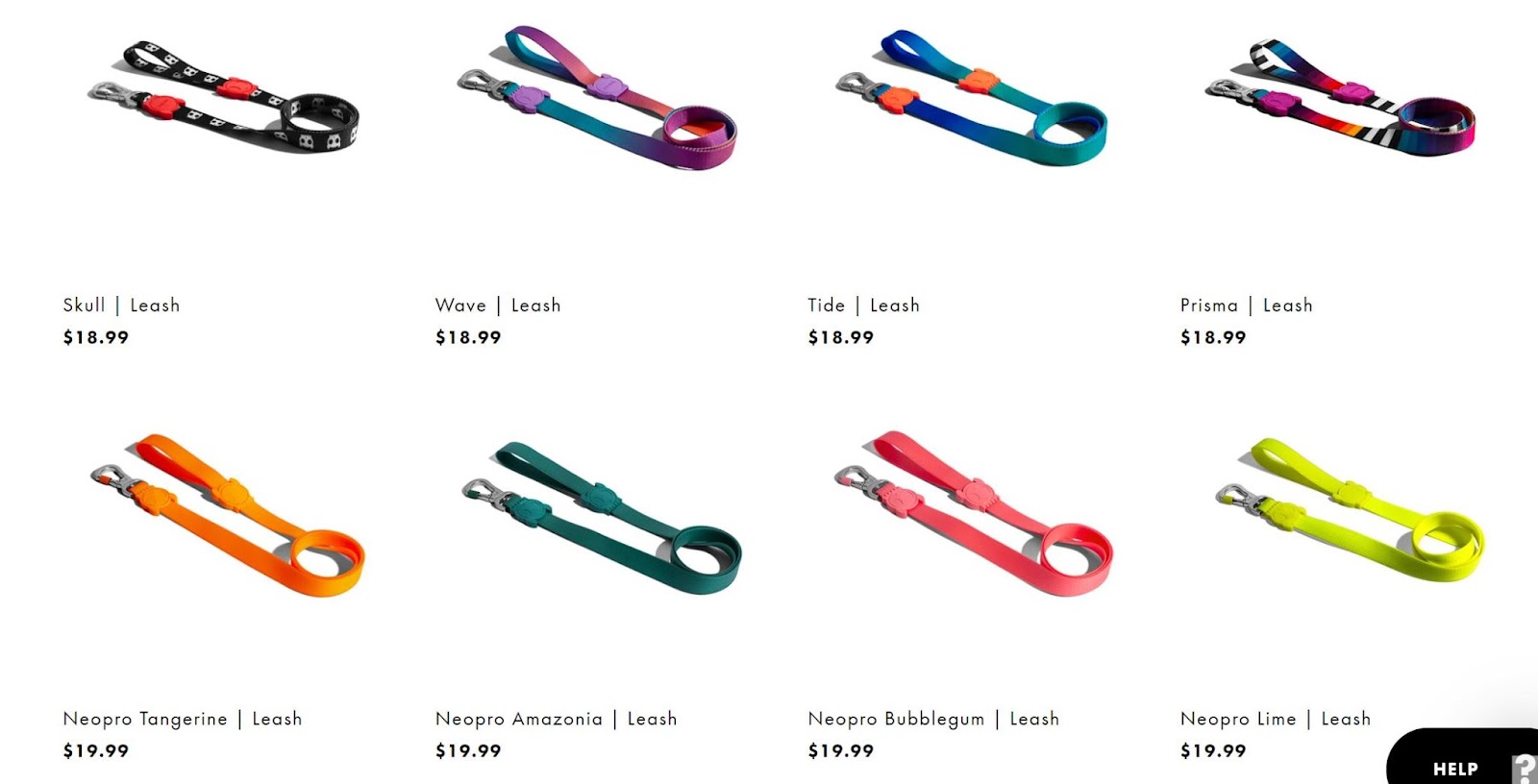
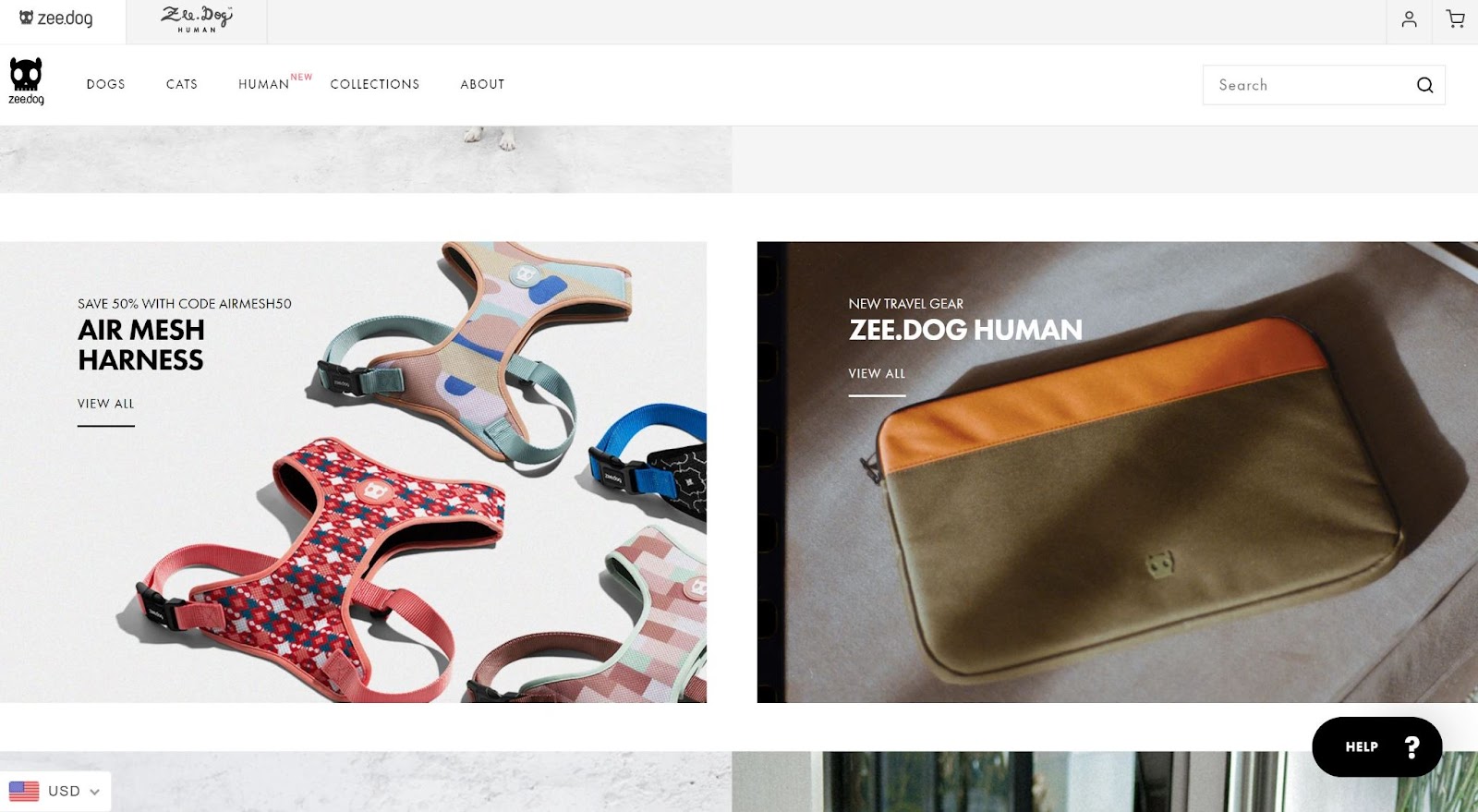
The website itself is very black and white. It’s straight to the point, and while the zee.dog logo has quite a bit of personality, the feel is functional. The interesting part is where the product comes in. They use their product as an enhanced branding opportunity. All of their items are bright, fun, and energetic. Instead of using the website to showcase their multiple color schemes, the product says enough.
It’s the perfect blend of urban and expression – two words used within their brand.
Zee.dog identifies themselves as a lifestyle brand for pet products (and have recently opened their merchandise to humans as well).
Gestalt Principles in Web Design
Similarity
The product pages are all laid out the same way. Product image angle, lighting, and the items are set up so every one of them looks identical to scale and spacing. With this principle, we can easily group these together as being part of the brand’s elegant organization, and telling the users that each of these products on the page function the same way.
Enclosure & Figure-Ground
The main page shows images with text. The styled photos are enclosed by the white background, which indicates that they are meant for a specific direction – to go to another page – as well as that they are the foreground on the page. This meets the enclosure principle by indicating to the user of a specific area with a means to an end. It also identifies with the figure-ground principle by visually showing a soft, white border so users can understand the content to put their focus on.
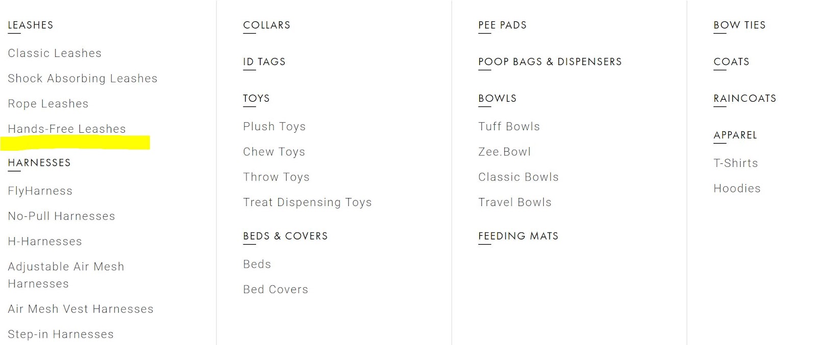
Proximity/Grouping
Within the drop downs of the main menu, each group of items are placed near each other. The master product is semi-bold, where the sub-products are listed beneath it in a lighter text. Between each list of products is whitespace which separates them (shown with the yellow highlighted area). This shows the proximity principle where the users can perceive each of them as one.
Emotions
Just by looking at the zee.dog website, you can tell that they take an urban and modern approach to their brand. But how can we see that?
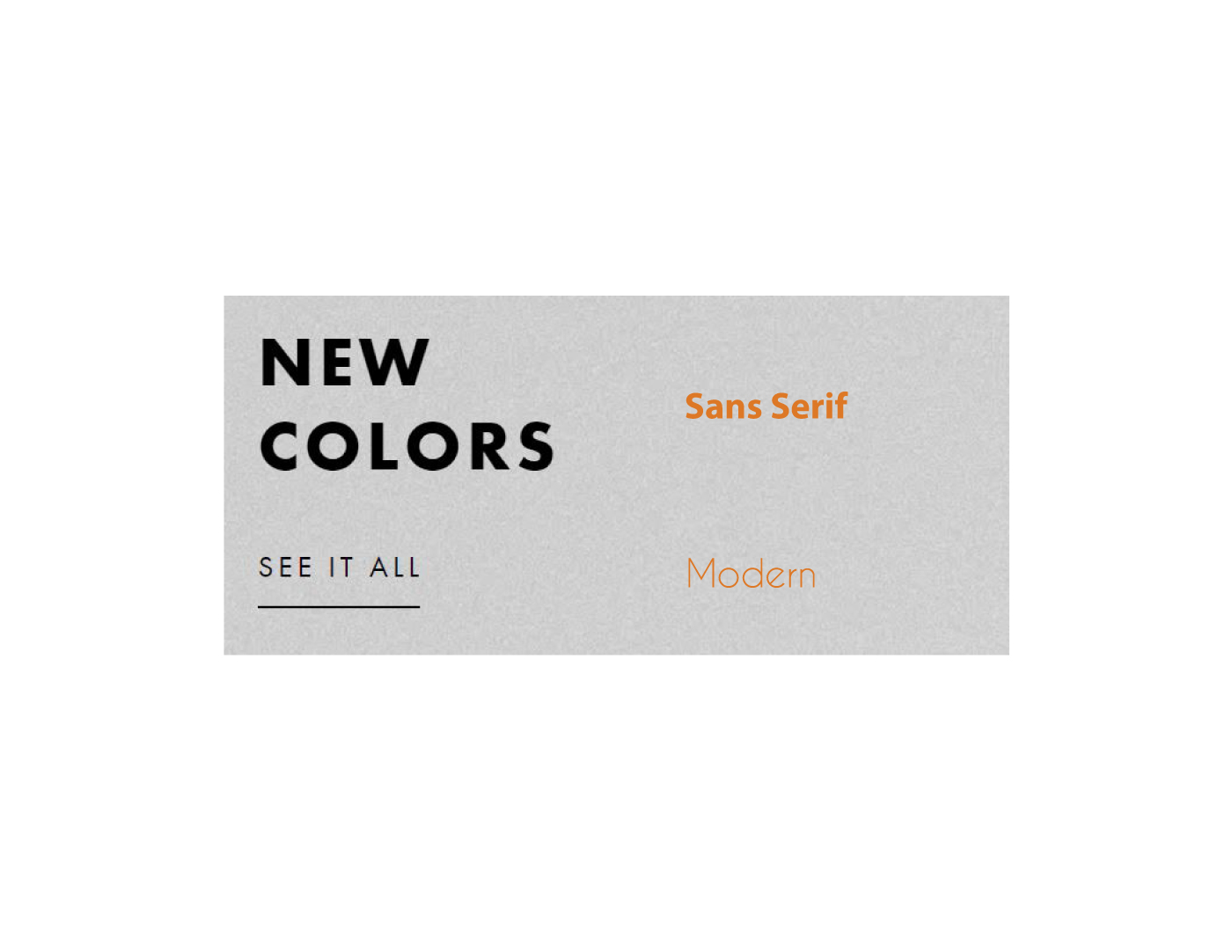
First, the typography is a mix of sans serif, and modern, which evoke futuristic and elegant feelings.
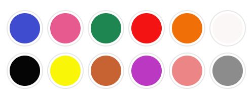
Colors also invoke emotions. Like I said earlier, zee.dog uses color through their products, rather than the site itself. The colors of products are bold and expressive. The site is white, black, and gray. White can mean cleanliness, black edginess, and gray as neutrality.
While each product and product category has different colors associated with it, the color scheme is prevalently bright. Vibrant colors tend to energize the user. This can be helpful for their target market audience, who are looking for something fun and different from the major retailers.
Mood Board
Mood boards are a fun and effective way to tell the visual and emotional story. For my mood board, I used a futuristic font to write the words “Urban. Lifestyle. Expression.” which are words that describe the brand and website. There’s a photo of a man with his dog in a space outdoors that looks concrete, showing the urban side of dog, human life together.
The main color scheme is subdued with white, grays and black, like their website. It’s clean and functional. The pops of color are vibrant and energizing. Because I’m thinking this would be a mood board for before the site’s actually designed, I included images of rough dog drawings which could be illustrations for a potential logo.

The textures are simple, like concrete or a chevron to promote the feelings of an urban lifestyle as well. Overall, the mood board is not overly populated, just like the feel of their brand and website.
I’ve made many mood boards in my day, but I must say that this was quite different, and enjoyable to do it the reverse-way. It really did help me to understand in some way the designers’ thought process on creating their site. From thoughts and emotions in typography and colors, to logistical organization with gestalt principles, I was able to create a successful on-brand mood board for zee.dog.
Citations:
Bonner, C. (2014, September 15). Using Gestalt Principles for Natural Interactions. https://thoughtbot.com/blog/gestalt-principles.
Bushe, L. (2020). Simplicity, symmetry and more: Gestalt theory and the design principles it gave birth to. https://www.canva.com/learn/gestalt-theory/.
Cao, J. (2015, April 7). Web design color theory: how to create the right emotions with color in web design. https://thenextweb.com/news/how-to-create-the-right-emotions-with-color-in-web-design.
Fussell, G. (2020, May 16). The Psychology of Fonts (Fonts That Evoke Emotion). https://design.tutsplus.com/articles/the-psychology-of-fonts–cms-34943.
